
The power of paint - The most dramatic way to transform your home.
- Nov 20, 2023
- 4 min read
Updated: Apr 2, 2025
So, you've made the plunge and decided you want to redecorate, you are sick of the colour on the walls, the colour that's been there for the past 10yrs! You've decided it's time for a change.
You have a pretty good idea of what you want, but you just need to narrow it down. This is where the major decisions start and if you don't get it right its going to be a time consuming and relatively costly mistake. So we thought we'd share a few tips with you on the power of paint, and how to avoid missing some really simple but crucial steps in your paint colour selection process.


Do you know the orientation of your room? Does it face North, South, East or West? This is a really important thing to consider when choosing a colour, especially when choosing between warm and cool colours.
North facing rooms can feel cooler and more harsh, due to the limited and "flat" light, so think about embracing darker spaces with a darker colour and a warm undertone. Or, if you want a light colour, go for a neutral with a yellow or red base, avoid colours with green or blue bases, because they will feel cold.
South facing rooms enjoy good light for most of the day, so many colours work in these spaces, it's more about going for what you like and what works best with your decor.
East facing rooms enjoy wonderful morning light which tends to have more blue tones in it, so consider blues and greens with a slightly warmer tone - this will mean the room won't feel cold and uninviting in the evening when the light has moved,
West facing rooms tend to feel more dramatic in the evening, whereas the morning light is muted. Warm tones accentuate the light and will almost glow, while cooler tones will change from morning into evening, feeling warmer in the evening light.


How and when will you use this room? Mornings, throughout the day, or in the evenings? TV watching, dining space or family lounge?
Your answer to this question will likely lead how you want it to feel; do you want light and bright, cosy and intimate or spacious and invigorating?
Woodwork is a totally different thing but it's worthwhile considering at this point as woodwork does not have to be white gloss! It can have a matt finish and also be far more complementary to the tone and colour of your walls than stark white.
Answer the above questions and it will help you narrow down further what colours you'd like to consider.
Everyone has their own school of thought when it comes to tester pots and how to make the best use of them. Some people don't even bother and plough on with a colour they have chosen from the colour card, and to those people I say if it works for you then thats fabulous! However, these few tips might just convince you there is another way to make doubly sure you've made the right decision. Taking the right steps and a bit of time here can prove to be invaluable in avoiding costly and time consuming mistakes later.


Firstly, don't paint tester pots directly onto the wall you are looking to paint, I know this will surprise a lot of people, but hear me out. Painting directly onto the wall will not only give you a false impression of the colour you are choosing, as it will be influenced by the current wall colour and other tester post samples sat alongside it, but it also prevents you from seeing what that colour looks like in other areas of the room.


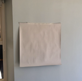
Instead, paint a piece of lining paper - this will mean that you can use the same swatch and move it around the room at different times of day. Doing that will give you the best impression of how the colour will look and feel in the morning and in the evening, as well as throughout the day as the light changes. You can also reuse that swatch for other areas of the house. This is a practice I use as an interior designer for all of my clients and projects and it works really well. You can also do the same with wallpaper - it's great to sit the wallpaper swatch and the paint swatch next to each other to see how they will work together.
Always make sure that you paint a good sized swatch, I would say at least a 50x50cm piece of lining paper, if not a little larger. Making the swatch as large as possible means that you will be less influenced by the current colour on the wall and also seeing a bigger area means that you get to see more of the colour.
Lastly, always ensure you use two coats on your samples, very few paints look the same colour with just one coat. This is really important if you are using highly pigmented paints such as Farrow and Ball. It's really quite surprising how different the colour will look. There is more than enough paint in a sample pots to do a couple of coats, on a couple of sections of lining paper.
Below are a couple of examples from our recent projects, they illustrate how colour can work so brilliantly to change a space. We chose the final colours after using lining paper swatches placed on the walls.


The blue wall advances towards you, making the room feel cosier and smaller.


From grey to green, this room now feels more intimate and welcoming, it feels warm and inviting and much more in keeping with its countryside setting.
We really hope this helps when you go to select paint colours for your next project. There is so much to consider when choosing a paint colour so if this advice helps in a small way we are thrilled.
If you would like our help on any of your up and coming projects, do please get in touch, we work on all kinds of projects throughout Yorkshire.
Happy Painting!


Upgrade your living room and your comfort level! Our new recliner sofa collection has just arrived. Discover the perfect blend of modern design and unmatched relaxation. Shop now